Radio cards
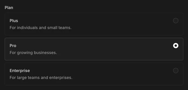
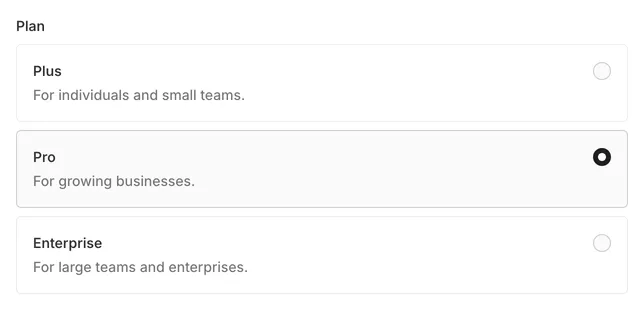
Show a radio field's options as stacked cards. Works with every style and palette.
import { RADIO_CARDS } from '@payloadpack/theme'
const radioCardLabel = (title: string, description: string) => (  <>    <strong>{title}</strong>    <span>{description}</span>  </>)
const field = {  name: 'plan',  type: 'radio',  admin: { className: RADIO_CARDS },  options: [    { value: 'plus', label: radioCardLabel('Plus', 'For individuals and small teams.') },    { value: 'pro', label: radioCardLabel('Pro', 'For growing businesses.') },    { value: 'enterprise', label: radioCardLabel('Enterprise', 'For large teams and enterprises.') }  ]}
In each label, the first element is the title and anything after it is a muted description. A plain string label shows as a title only.