Skip to content

Styles and palettes

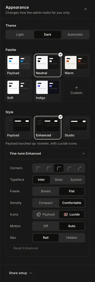
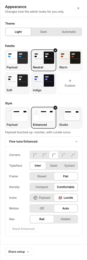
What your editors can pick in the Appearance panel. Every style works with every palette.

Editors open the panel from the Appearance button in the nav, and each pick is saved to their account. You set the default and which styles and palettes they can pick in Configuration.

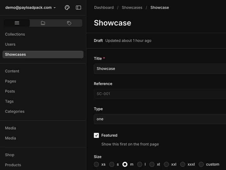
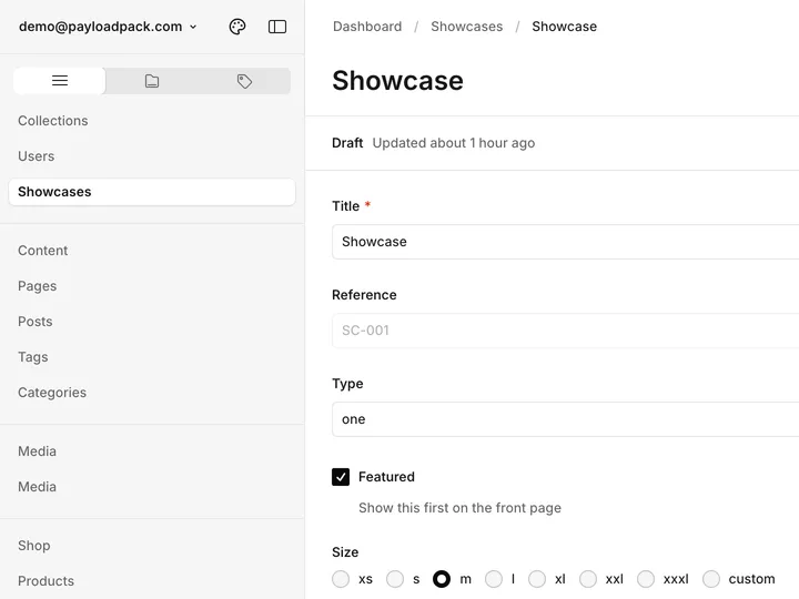
An edit view with the Payload styleAn edit view with the Payload style
PayloadPayload's own layout.
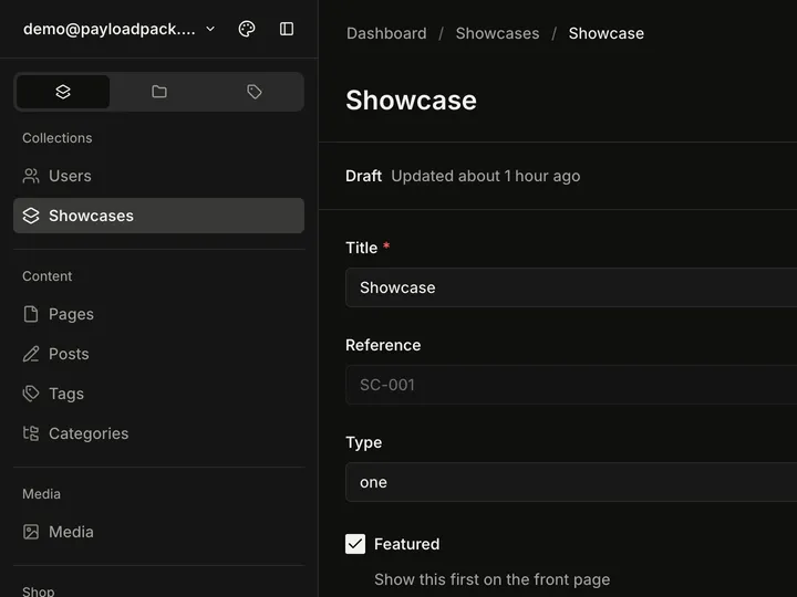
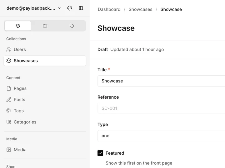
An edit view with the Enhanced styleAn edit view with the Enhanced style
EnhancedPayload touched up: roomier, with Lucide icons. The default.
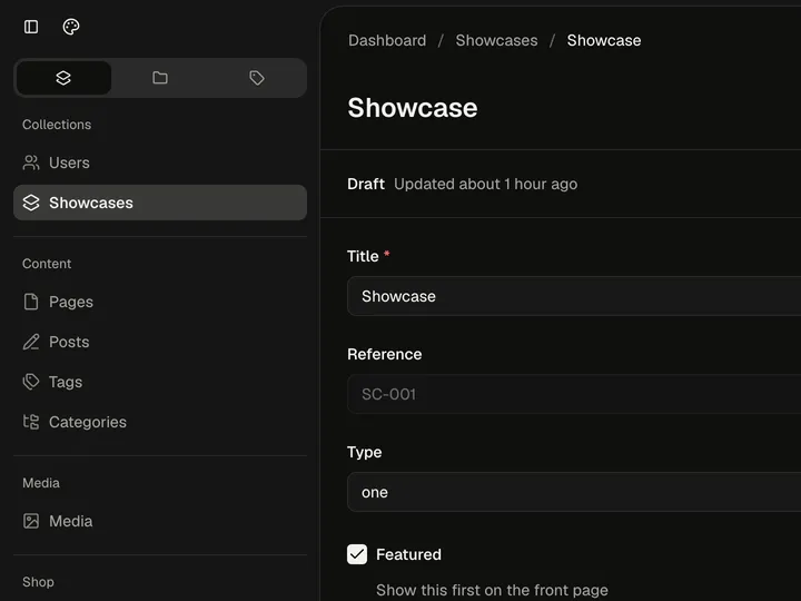
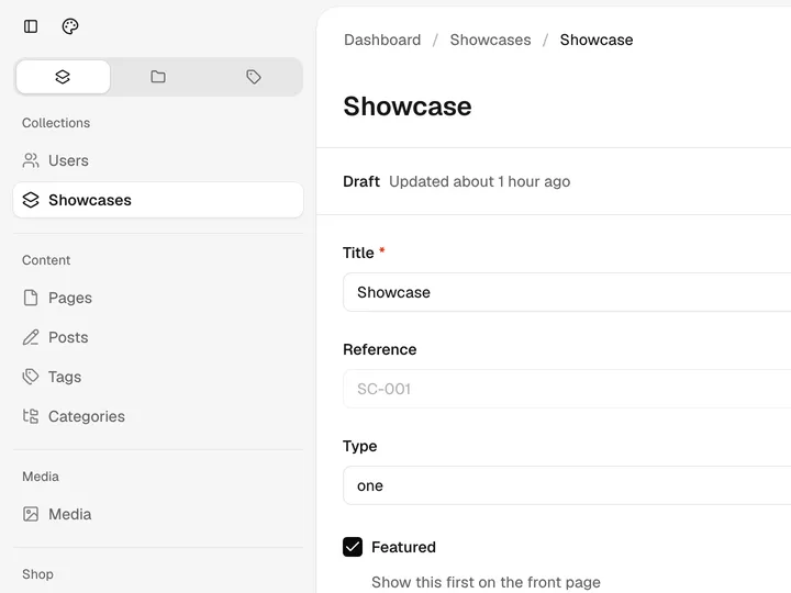
An edit view with the Studio styleAn edit view with the Studio style
StudioEach view in a soft card, with Geist and larger corners.

Enhanced and Studio come with options for corners, font, frame, density, icons, motion and the nav.

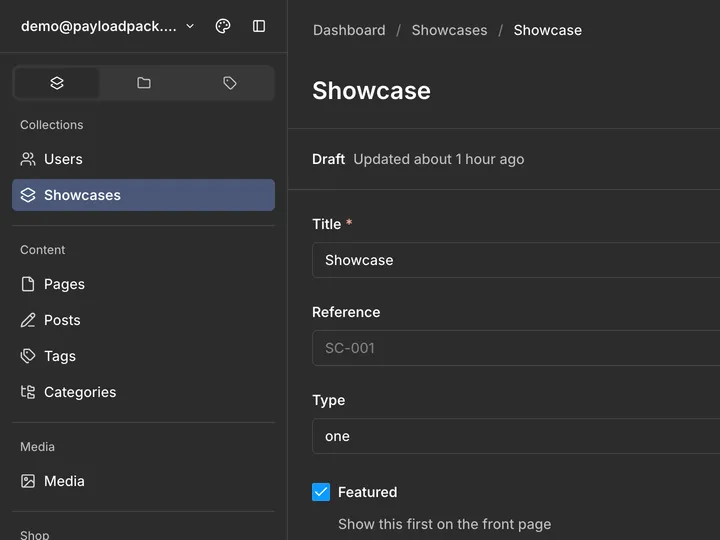
An edit view with the Payload paletteAn edit view with the Payload palette
PayloadPayload's own colors.
An edit view with the Neutral paletteAn edit view with the Neutral palette
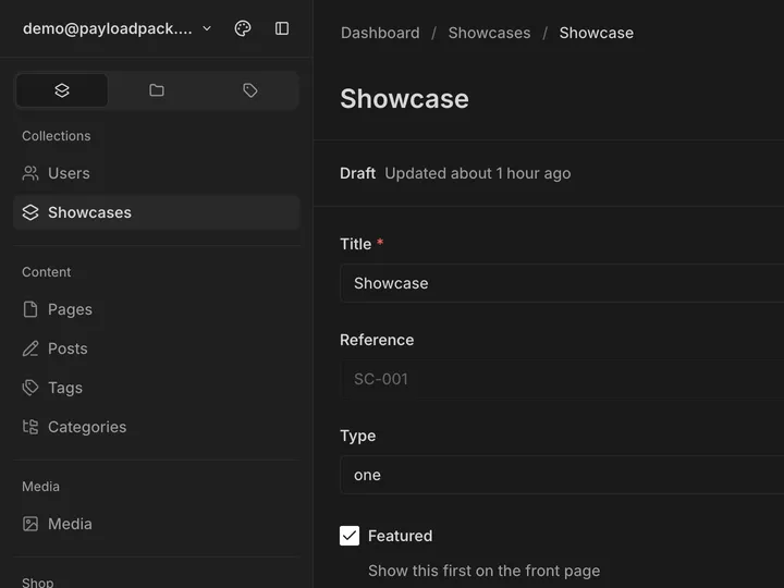
NeutralSoft greys, near-black in dark mode. The default.
An edit view with the Warm paletteAn edit view with the Warm palette
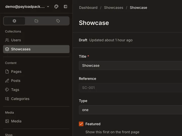
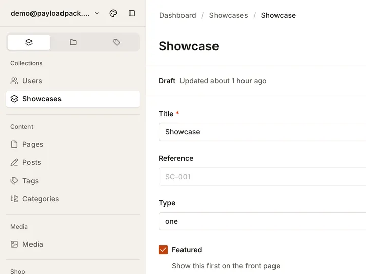
WarmA copper tint on the field and nav.
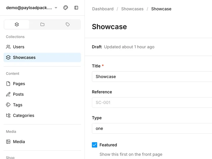
An edit view with the Soft paletteAn edit view with the Soft palette
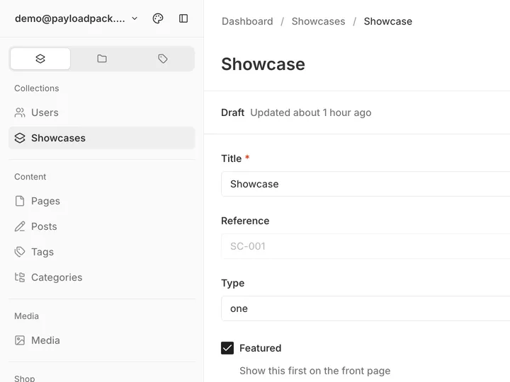
SoftQuiet greys with a blue accent.

Editors can also mix their own colors in the panel. To give everyone your brand’s colors, add a palette.

The Appearance panel with Theme, Palette and Style sections and Fine-tune openThe Appearance panel with Theme, Palette and Style sections and Fine-tune open